
VILLAGE GREEN COMPANIES
During my five-year tenure at Village Green, I played a key role in rebranding the company while advancing from Graphic Designer to Senior Creative Manager. I managed a portfolio of over 120 apartment communities, overseeing graphic design, web design, and branding. This work aligned with Village Green’s mission to provide exceptional living experiences through innovative design and a commitment to quality. The rebranding efforts refreshed the company’s visual identity, enhancing its appeal across diverse markets.

VILLAGE GREEN
"VOICE" MONTHLY NEWSLETTER PUBLICATION
As part of my rebranding efforts at Village Green, I revamped their monthly publication, "The Voice." This publication was a key communication tool for both internal teams and residents. I updated the design, layout, and overall aesthetic to align with the company’s refreshed brand identity, ensuring a more modern and engaging presentation. The redesign enhanced readability and visual appeal, helping "The Voice" better reflect Village Green’s values of community, innovation, and quality.

VILLAGE GREEN
WEBSITE DESIGN
As part of my role at Village Green, I led the redesign of their website to better reflect the company’s updated brand identity. The new website featured a modern, user-friendly interface that enhanced the online experience for both prospective residents and clients. I focused on streamlining navigation, improving visual consistency, and incorporating responsive design elements to ensure optimal functionality across devices. This redesign not only improved the site's aesthetic but also helped boost engagement and made it easier for users to explore Village Green’s apartment communities and services.

VILLAGE GREEN
BUSINESS CARDS
As part of my branding responsibilities at Village Green, I created business cards for all newly developed properties, ensuring that each one aligned with its unique brand identity. I not only designed the cards but also developed comprehensive branding for each property, including all collateral such as brochures, signage, and digital assets. This work was crucial in establishing a cohesive and professional look for each community, enhancing their market appeal and reflecting the high standards of Village Green.

VILLAGE GREEN
REBRANDED VG LOGO
I was responsible for designing the new Village Green logo as part of the company’s rebranding initiative. The goal was to create a modern, timeless symbol that captured Village Green’s rich history while representing its forward-thinking approach to property management. I focused on clean lines and a fresh color palette to ensure the logo would be versatile across both digital and print platforms, reinforcing the company’s reputation for quality and innovation across its portfolio of apartment communities.

VILLAGE GREEN
CORPORATE BROCURE
In my role at Village Green, I redesigned the corporate employee brochure to better reflect the company’s updated brand identity and core values. The new design focused on creating a polished, professional look that would engage employees and potential recruits alike. I modernized the layout, improved the visual flow, and incorporated consistent branding elements such as the new logo, color schemes, and typography. This redesign helped to clearly communicate Village Green’s mission, culture, and benefits, aligning with the company’s commitment to excellence and innovation.
VILLAGE GREEN
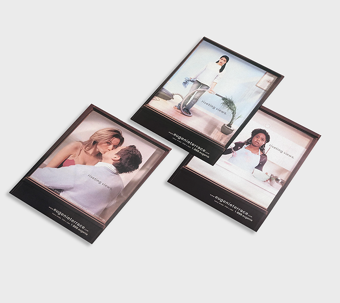
EUGENIE TERRACE CHICAGO APARTMENT AD CAMPAIGN
In the "Riveting Views" campaign I created for Village Green, we captured intimate and authentic moments inside high-rise apartments. The visuals featured residents in everyday scenarios, like sharing a kiss, making a mess while cooking, or tidying up their homes. This approach highlighted the lived-in, personal aspect of the apartment communities, portraying them as spaces where real life happens, full of warmth and connection. It helped potential residents envision their own stories unfolding in these modern, vibrant spaces.
VILLAGE GREEN
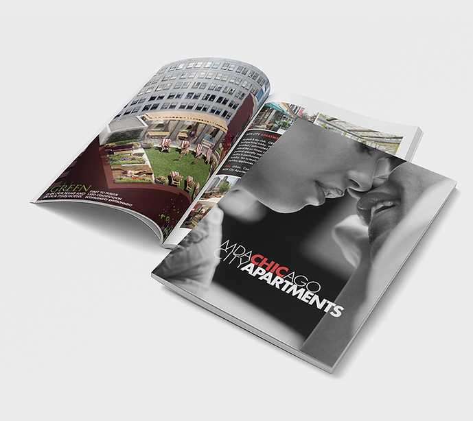
MDA CITY APARTMENTS CHICAGO
PROSPECTIVE RENAL BROCHURE
I designed a prospective member brochure for MDA City Apartments that reflects the brand's cutting-edge identity and urban appeal. The brochure features a modern layout with bold red and black accents, complemented by striking visuals that showcase the luxurious amenities and vibrant lifestyle available to residents. Each section highlights the unique aspects of living in downtown Chicago, from the apartment features to the surrounding community. The overall design is sleek and engaging, aiming to attract potential residents by conveying the excitement and sophistication of life at MDA City Apartments.
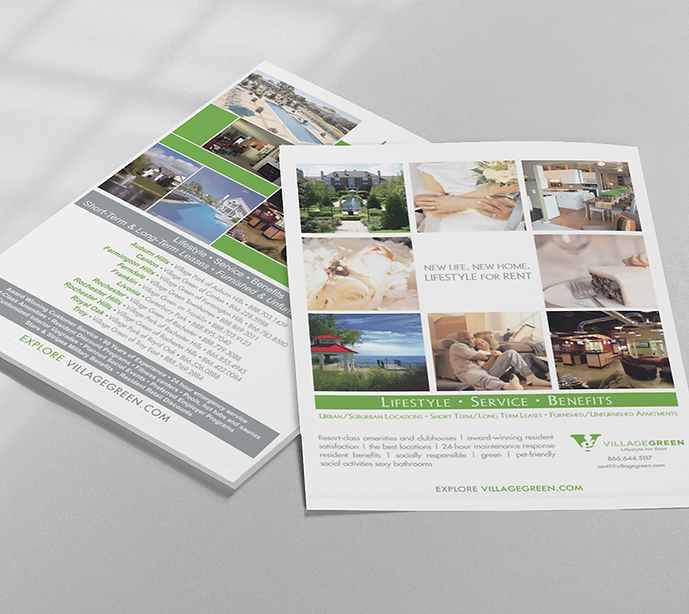
VILLAGE GREEN
CORPORATE ADS
As part of Village Green's rebrand, I designed a series of corporate ads that captured the essence of the company’s refreshed identity. These ads featured a cohesive visual language with the new logo, color palette, and typography, all aimed at promoting the company’s commitment to quality and community living. I focused on clean, modern designs that highlighted Village Green's services and unique selling points, using compelling imagery and concise messaging to engage potential residents and clients. The ads were strategically placed in various media channels to maximize visibility and reinforce the brand's presence in the market.
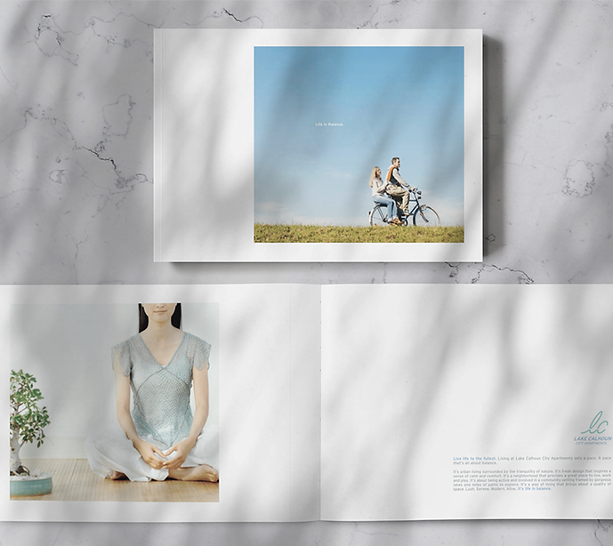
VILLAGE GREEN
LAKE CALHOUN MINNEAPOLIS APARTMENT BRANDING
I developed a peaceful brand for Lake Calhoun Apartments in Minneapolis that encapsulates a serene and relaxing lifestyle. The cover features a charming image of a couple riding a bike together, evoking a sense of community and outdoor enjoyment. Inside, the brochure includes captivating visuals of yoga sessions and tranquil scenes, reinforcing the theme of peace and mindfulness. The overall design emphasizes a harmonious connection with nature and wellness, appealing to those seeking a calm retreat within the vibrant urban environment of Minneapolis. This branding effectively communicates the lifestyle residents can expect at Lake Calhoun Apartments, where tranquility and community coexist.
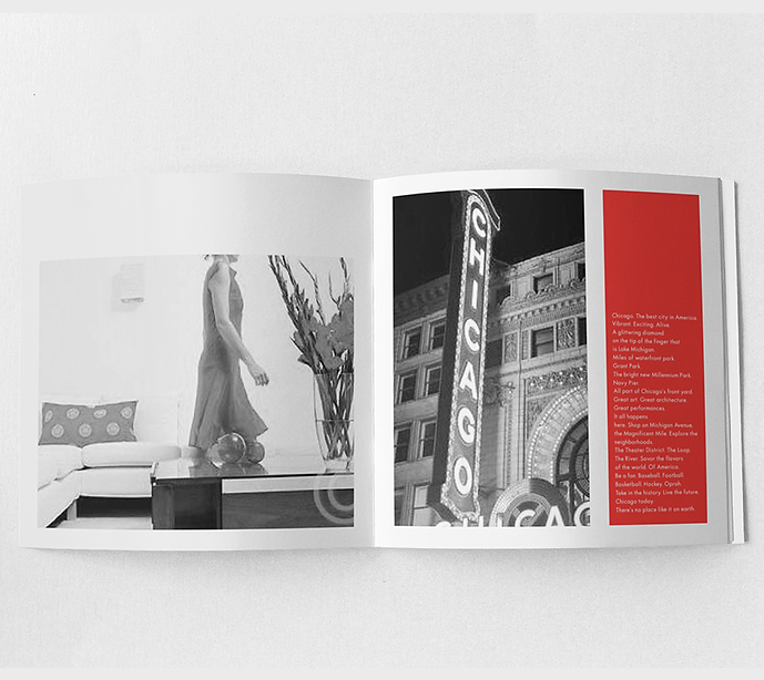
VILLAGE GREEN
MDA CITY APARTMENTS CHICAGO
BRANDING
For MDA City Apartments in downtown Chicago, I crafted a cutting-edge brand that exudes modern sophistication and urban allure. Using a bold red and black color palette, I incorporated the iconic Chicago sign to emphasize the building’s prime location in the heart of the city. The sleek, sexy design was tailored to appeal to a cosmopolitan audience, highlighting the luxury and vibrant lifestyle offered by the apartments. This striking brand identity set MDA City Apartments apart, aligning with the energy and style of downtown Chicago.